
How to build a Responsive Table in Squarespace
Hi everyone. Every now and then I see someone asking how to build a responsive table in Squarespace. Here is some sample code for you to work with. My solution is accomplished using a code block. The example I will give you creates a table that has a title and alternate colored rows (I think that looks nicer on a webpage than just 1 color). My example has 3 columns.
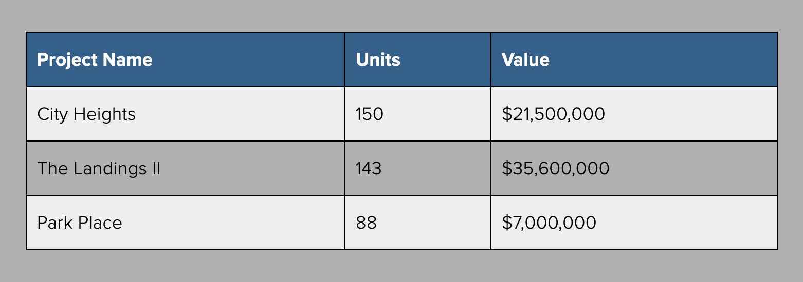
On Desktop and tablet it will look like this:
And on mobile it will look like this:

Paste the following into a code block.
<style>table { width: 75%; border-collapse: collapse; margin: auto; }/* alternate row colors */tr:nth-of-type(odd) { background: #eee; }th { background: #335f8b; color: white; font-weight: bold; padding: 10px; border: 1px solid #000000; text-align: left; font-size: 18px; } td { padding: 10px; border: 1px solid #000000; text-align: left; font-size: 18px; color: #000000; }@mediaonly screen and (max-width: 760px),(min-device-width: 768px) and (max-device-width: 1024px) { table { width: 100%; } table, thead, tbody, th, td, tr { display: block; } thead tr { position: absolute; top: -9999px; left: -9999px; } td { /* look like a row on mobile */ position: relative; padding-left: 50%; border: 1px solid #000000; } td:before {position: absolute; /* Top/left values mimic padding */ top: 6px; left: 6px; width: 45%; padding-right: 10px; white-space: nowrap; /* Label the data */ content: attr(data-column); color: #335f8b; }}</style><table> <thead> <tr> <th>Project Name</th> <th>Units</th> <th>Value</th> </tr> </thead> <tbody> <tr> <td data-column="Project Name">City Heights</td> <td data-column="Units">150</td> <td data-column="Value">$21,500,000</td> </tr> <tr> <td data-column="Project Name">The Landings II</td> <td data-column="Units">143</td> <td data-column="Value">$35,600,000</td> </tr> <tr> <td data-column="Project Name">Park Place</td> <td data-column="Units">88</td> <td data-column="Value">$7,000,000</td> </tr> </tbody></table>